Week 1
25th september First impressions of the brief and of the workshop are a little of panic at my understanding of myself as an illustrator and really what i want to be promoting my self as. what is my intent . I really need to be clear on what this is as it is integral for me to produce a piece of work that is going to show my best of me. I am meeting with Georgina later today to help with my thought process and i will hopefully have a better scense of who i am and what to do as this problem covers the whole course, from FMP through to Professional practice. I am at war with what i love to do what i can do and what i think i can do.
However this being said the thought of learning more about the professional information needed to produce work to a clients expectations from the technicalities of development through to the final outcome printing professionally excites me .
The BRIEF : The letter my initial thoughts are great i love a good nostalgic letter something with meaning and a story behind it I just don't know how to approach any ideas i have Currently and make them in to a narrative and not just a pretty letter .
My first thoughts and ideas :this is kind of similar to a topic i looked at in A Level art.
I found a set of love letters between my grandmother and my grandfather from when they where young and living in cheltenham. These letters where sent during the war and show how communication has changed when my granndmother Daisy left my grandfather Kennith they would have continuous conversation through letters day After day in an endering way . These letters are the curiosity of some of the things they have written These letters mean a lot to me as It is what i have formed my ideas of what my dads parents are like as they both sadly passed just before I was born. I have been able to look at the houses they lived in . here are some engravings of the envelopes i did during A level When i next go home i am goin to gather these letteres and see if this is a starting point for one of my ideas.

Also there are a considerable amount of letters in the bible and it may be interesting to illustrated these
http://www.christianity.org.uk/index.php/the-bible-letters.php
Workshop
After Delores workshop i am Antisipating learning a lot more about illustrator and become confident at InDesign and making myself more professional In my online presence.
Georgina's workshop
What is a letter?
Key words and spider diagram
Note
secret letters
school letters across the classroom
reminders
Delivery
Red post box
postman pat
the jolly little post man
postcards
seasonal cards( christmas, easter ,birthday)
Wedding invitation
care package
Message
Telegram
text
love
instructional
encouraging letter
Long distance
Pen pals language lessons
War letters from soldiers
politics
Wishes
God prayer book
Tooth fairy
letters to santa
memories
Lost letters
postcards
long lost letters
found money
invites reunions
dead partners letters
poems in letters
Time capsule
Feelings
Ps.i love
Discussion
Argumentative letters
Business letters
Confession
Murder
Animations


We discussed the use of the Cut Paper in the animation as a strong was of communication and they liked the idea of experimenting with bringing it in to a flat image for print .
Looking at more options for letters theme
Drawing thumbnails Workshop
I seem to have loads of ideas but no visuals but i couldn't see visuals at first for the ideas that i had but during this tutorial i created a few thumbnails and ideas

 |
| looking at the life of a letter and the journey it goes on in a little frame by frame adventure |
 |
| the top idea is of a letter collage folding to make a 3D origami paper bird playing on the idea of a carrier pigeon not sure if this will work as a printed in image in olio i think i need to think 2D . The second page is of a beach where letters are written in the sand and tide is washing them away however not happy with composition and the textures and the concept will be hard to show don't feel like this is a strong idea. |
As i was struggling on what to create i decided to do some more research in to different letters
Letters of note : I was drawn to the Recipe of drop scones that was sent between eisenhower and Queen Elizabeth here is the recipe :
The Queen’s drop scones recipe
4 teacups flour
4 tablespoons caster sugar
2 teacups milk
2 whole eggs
2 teaspoons bicarbonate of soda
3 teaspoons cream of tartar
2 tablespoons melted butter
4 tablespoons caster sugar
2 teacups milk
2 whole eggs
2 teaspoons bicarbonate of soda
3 teaspoons cream of tartar
2 tablespoons melted butter
Beat eggs, sugar and about half the milk together; add flour. Mix well, adding remainder of milk, bicarbonate and cream of tartar. Fold in butter.
Enough for 16 people.
http://clickamericana.com/topics/food-drink/queen-sends-eisenhower-her-drop-scones-recipe-1960
I also came across a letters to a unknown soldier a new kind of war memorial that is found at st pancreas station It is a soldiers statue but people are encouraged to write letters to the statue as if it where a soldier it makes an interesting read in to peoples respect for the soldiers of the World War. http://www.1418now.org.uk/letter/
Research in to artists and letter works of art:
 |
| Found on etsy I love the idea of using collage and then making it clean by making it a silhouette |


 |
| more paper cut inspiration |
 |
| Collage that was photographed to show shadows clever use of colour and tone to ecxentuate the 3D Effect |
 |
| Matisse the codamus 1943 |
 |
| the sheaf 1953 Matisse |
The cut out was not an renunciation of painting and sculpture: he called it “painting with scissors.” Matisse said, "Only what I created after the illness constitutes my real self: free, liberated.”
Workshop in Photoshop - Making Bit maps for Web Comics Notes taken making an image a bitmap To create a bitmap for web comic
Bit map is either black or white
Photoshop antialias bit map isn't the same thing
Scan in at high resolution at 600 then change to 1200
Image mode grayscale not just changing to black and white get rid of pixleation
Transparent layer
Change threshold Levels threshold on layer to suite.
You can now fill with colour easily with out pixilation around line .
Deciding Ideas
Ideas I have chosen on as i was struggling to come up with images for some of my ideas I thought i would take inspiration from what I had already being the letters of my grandparents. whilst back at home I was looking for the letters that my grandparents sent to each other I found a Folder full of transcripts from a radio Show that i had forgotten my Dad listened to on a sunday morning which is Called Letters from america. When i was 7 my dad passed away from cancer however one of my fond memories where of playing with my soft toys on his bed with him at the weekends especially a sunday. Although i remember always having to leave his room to let him have 15 minutes quite listening to his programme called letters from america. In which at 9 O clock Alistair Cooke would report on the events of political fashion and importance of the week Through doing some research in to the radio show i found that it was the longest running radio show of its time running every week from 1946 to 2002 .To find out more about Alistair Cookes radio show click here :
http://www.bbc.co.uk/programmes/b00f6hbp
I have found both of my ideas now both personal and excited by them both equally:
initial ideas drawings!

these initial sketches show my ideas for the two outcomes .
The top one being a picture of myself as a child looking in on my dad sitting in his bed most of this picture is constructed of my memories from when i was 7.
The bottom one being a collage of the houses with elements of maps and letters and image of my grandparents.
Image sourcing :
 |
| photo of my dad with grandad |
 |
| dad in bed |
.JPG) |
| the room lay out now but it has hardly changed helps give perspective on the door |
 |
| the stripy pyjamas that i remember him wearing |
.JPG) |
| the room from the inside looking out getting dads perspective of me peering in |
Play with tone and limited colour palette
 |
| initial sketch not really scaled to olio |
 |
| double page lay out |

Tonal painting of the image
 |
| starting colour test for image |
 |
| Limited colour pallet and covering the spectrum of tones |
Evaluating idea
Although i like the starting point of the letters from america I have realised my initial idea of the memory of the room is not the best way to Show this the image is very busy and i don't think i could use paper cut to produce the picture . I also don't have much confidence in perspective as well as in drawing people both of which i would need to be comfortable doing well in order to do this sketch justice. I do like the colours chosen however I feel that the Blue and Reds represent the american flag and culture and the browns give a warm tone and nostalgic feeling. I am going to spend some more time looking in to different ways of portraying this theme of the radio show.
Second Idea
My second idea is based on the two houses that the letters where sent between as it is symbolic of the distance between my grandmother and grandfather . My Grandmother, Daisy had kept the love letters and envelopes that my Grandfather ,ken, had sent from Cheltenham to the isle of skye where Daisy was visiting her parents. The letters were sent in 1944 during the war and my grand parents had just got engaged so were deeply in love and my grandfather a romantic couldn't stand to be apart from her. through the addresses on the letters and envelopes i have been able to source images of the houses and i have pictures of my grandparents at there wedding that i can work with as well.
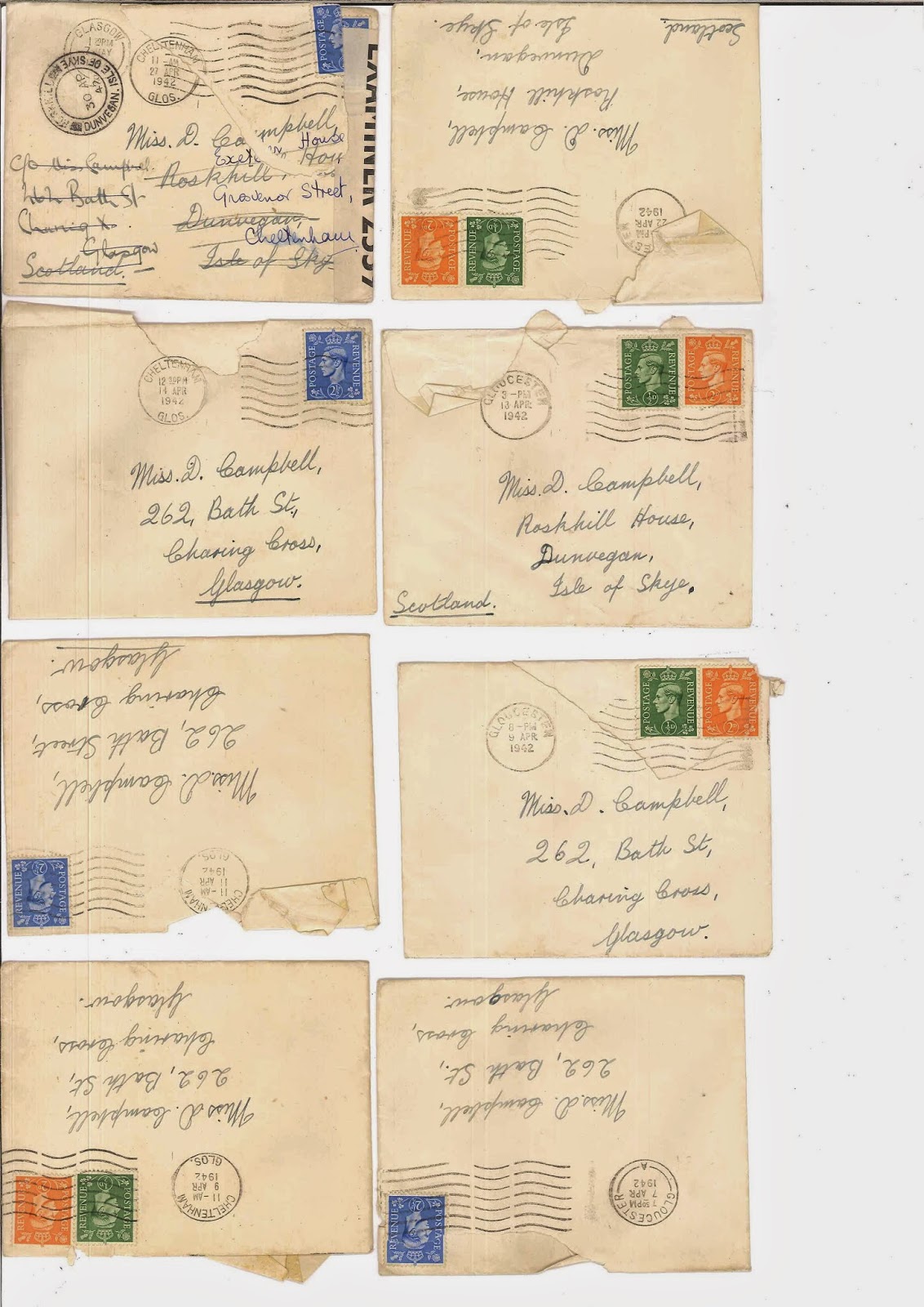 |
| here are some of the envelopes |
 |
| back of the envelopes |
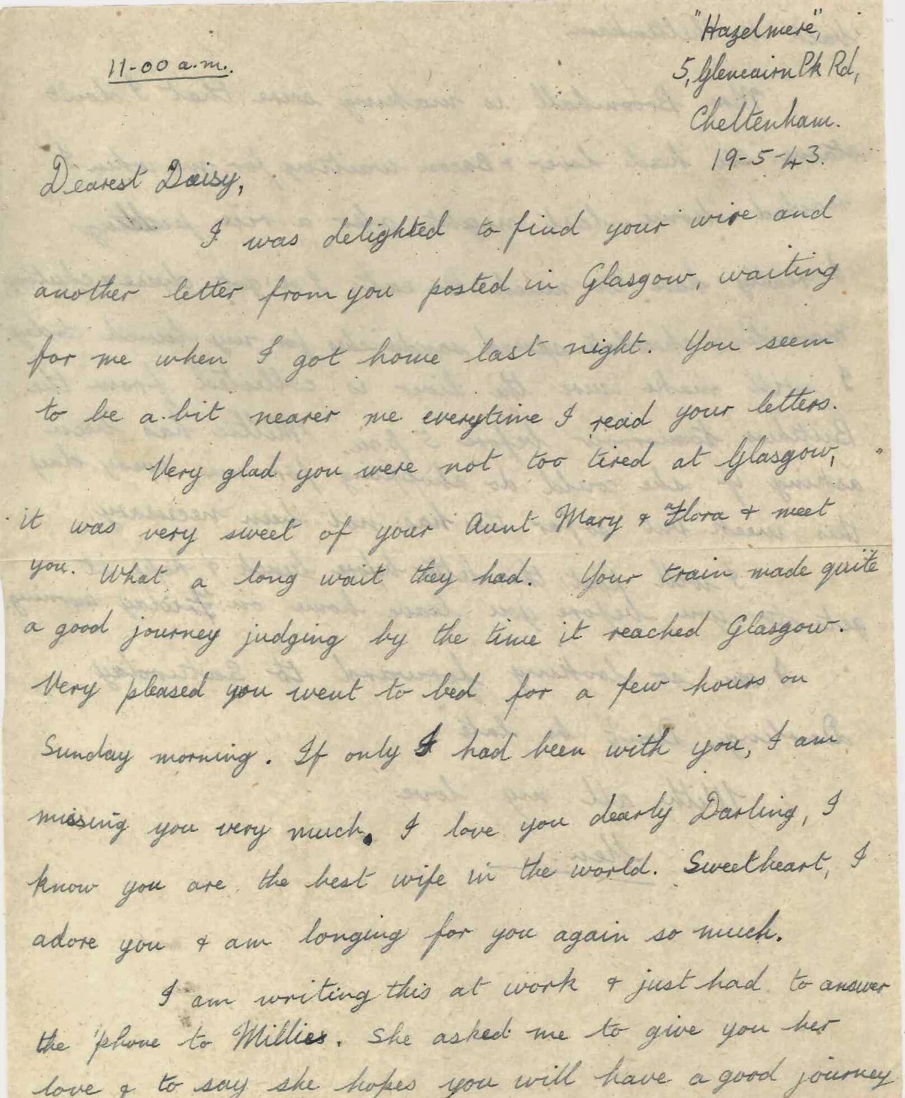 |
| one of the letters that are always addressed Dearest Daisy |
 |
| Back of one of the letters that are always signed with all my love Ken |
.JPG) |
| my grandfathers house 28 Grovenor's street cheltenham |
.JPG)
 |
| here are google images of my great grand parents house ' Roskhill house' in the isle of skye |
 |
| Roskhill house Isle of skye |
 |
| Roskill house isle of skye |
.JPG) |
| Picture of my granparents before they passed away in 1990 |
 |
| Adding colour in a limited colour pallet using Gouache |
 |
| Grand parents leaving there wedding reception photo 1945 it is inkeeping with the times of the letters. |
 |
| I photoshopped them apart adding arms from each other so i could have a realistic silhouettes of them apart. |
I already owned a map of cheltenham which was my Granddads from the 1949 but didn't have any access to old maps of the isle of skye. I found in a charity shop out of pure luck a book of british maps and of the 1900's .
This was important not only to be true of the era but also for copyright laws. Through research i had found that it is illegal to copy and or use maps within the last 50 years . And as Olio is up for publication i would not be able to use any earlier maps for my art work.


As well as sourcing maps i also Scanned in objects and papers to get authentic colours and textures as well as buying paper in an assortment of colours that i though i may need.
.jpeg) |
| old folder |
|
| letters |
 |
| old ordanace survey map |
.jpeg) |
| isle of skye page in book of maps |
 |
| by cutting out by hand i created map silhouettes corresponding to the places of the people . I love that there is a difference between the colours used in the maps as one is an ordnance survey map and one a road map but there is a small correspondence in colours which i plan to pic up on in the colours of paper i have chosen to work in . I also played around with the size of the people originally making them to big and then perfected the size to look good in-front of the houses. |
limited colour palette
through having to buy the paper i was forced due to price to pick a limited colour palette and i choose to go with authentic old greys browns and creams to use to make my paper cut outs.
 |
| the colour pallet of paper i bought |
 |
| I then condensed the colour pallet even more |
 |
| trying to draft out a sketch of the house |
 |
| Found it was better to trace the shape of the house from a photo and use the tracing paper as a template to cut around. |
using a craft knife to draw shapes focusing on positive and negative space and use of shape and colour I was then able to play around with how things sat together using a template .
 |
| my working station |
As there is something more permanent when using cut paper than pencil which can be rubbed out i started to create templates of structures by using tracing paper which allowed me to then take the tracing paper and cut along the lies but see through to what i was cutting and knowing how it would look giving an Element of control to the images.
 |
| I dont like how the detail in the door doesn't show up very well and how your eye is drawn to it as it is the darkest block of space. I think I need to try another colour in the background although it is not photo realistic in colours it will look more astetically pleasing |
 |
| playing with the use of photocopied lace to be curtains I don't like this detail as it looks messy in the image . |
This house needs to be a darker tone although this is more of a realistic version of the house there needs to be a greater contrast in the colour of the windows and the building to make the difference between the black and the building less stark. Tonal value of this house is incorrect. Also I began by trying to make the house look realistic by including parts of the photo as can be seen in the chimney and collaging netting lace for curtains , however i realised that this has unnecessary and took away from the character of the house rather that adding to it.
Looking at simplification and paper cut through working in this style i have noticed similarities between my work and Molly Bang.
 |
| hansel and Gretel |
 |
| little red ridding hood |
 |
| hansel and gretel |
I love the visual balance that Molly has in her images of shape and colour. It is so simplistic yet really effective her representation of objects as shapes and the mood it portrays is so unique.
I have enjoyed looking at her picture this slides about how she choses her shapes to represent characters and how she can affect how we feel when looking at the images by only changing one small thing like colour. I feel that her looking in to her working process has helped me make mine stronger by being braver by testing and changing colour and small details as you will see further in this blog post.http://steve.muratore.tripod.com/graphic_ss_picture-this.pdf
Reworking the Letters from america idea
 |
| It is the top redesign on this page that shows the ides I have had for representing the time difference between when letters from america started and when it finished . Looking at how merging a old and new radio would look . |
 |
| Radio from the 1940's |
 |
| Digital Radio Alarm from 2000 |
 |
| Combibation of the two radios I decided after looking at the reference images that i chose to use that the radio made more scene if it where one on top of the other. |

After looking at the Original sketch I decided that it was too central and that the gutter of olio would cause a problem and break up the image to much .
I looked a bit at iconic american Art and posters especially political :
 | ||
politician badges
|


I was able to personalise the radio clock even more by changing the numbers on the dial on the older radio to represent the time line of letters from america.
 |
| here is the template i used to cut the radio the intricate cutting made easier with the use of tape. |
I began to scan all the parts of my work in separately to then piece together in photoshop so i could move them easily but then realised the organic nature of paper cut would be lost and it would be extremly time consuming and fiddly and that photos and scanning would be ok for the final images and the rough presentation. Here are all of the elements separately though.
.jpeg)
.jpeg)
.jpeg)
.jpeg)
These are the two images i took in to the Presentation.
I photographed the images as I was unsure of the final positions of all of the elements so couldn't scan them in as complete images.

 |
| Cropped to the size of olio in photoshop and then editing in photoshop after doing a print run realising that the colour was very dull I changed this by uping up the contrast . |


I noted that the images were very close to how they would look as the final product as I spent a lot of time in the cutting process which for me was the thought process to make the roughs as i kept moving paper around and changing the paper colour .Though not wanting to make mistakes and not knowing how to create a rough as such I produce two images that where both quite close to there final images . But i was ready to make changes and take onboard anything they felt needed changing and was interested to see which one was liked best as I didn't know.
And the the feedback i got was very Useful.
As the client liked both of the images,It was hard fro them to chose and was torn 50/50 . Liking the personal touches with the map and silhouettes of the grandparents love Letter but really liking the graphic and stand out quality of the letters from america both clever and symbolic in there own right and both would work well in the Olio page formate. They agreed with the image being full bleed letting the collage paper take over the page and not be interrupted with a white border .
Things to change and to think about where to play around with the size of the house and the reason for it being a 3D house in my grandmas house in skye and to give it a sense of place that the isle of skye gives through mountains
Adding more details to the images in little touches but still keeping the balance of the colours suggesting to bring some blue out from the map .
And in the second to try and make the radio less dominate on the page of the english flag as there is a nice use of negative space and open paper on the towers page and try balance the size of the page being taken up .
It was decided that as I Said I wanted to complete both for my portfolio that it would be decided once the changes where made and print test run .
Plan
- Neaten cuttings and imperfections on the paper
- change the size of the radio to be smaller
- Add more details to the door of Granddads house and adding in steps
- Give context to the the Grandmas house adding in hills / mountains to give more information that it is Skye.
- To work out a professional way to capture the images through photography covering with glass and using two lights at 45 degree angle to counter the reflections and the or scanning.
Here are the changes to the images of the houses
By revisiting the comments made on the layout of the images I made another sketch up of the possibilities for the house size details and hills
 |
| Initial sketches adjusting the image house size and adding scenery. |
 |
| To make the house smaller in order to give a scenic context to the page i scanned in the image and reduced the image by around 78% and adjusted the size till i was happy with the outcome. I then made a new tempate on tracing paper in which to follow . and experimented at adding hills in the background. |
 |
| making a tracing paper template for the hills |
 |
| taken details from the letters |
 |
| trying out different combinations of hills and colour of the path |


Changes to the radio clock
 |
| to make the clock smaller I Copied the image but reduced the size of the image like i did to the grandmas house and and then used it to be a template so the original essence was not lost . |
I also recut the flags and spent time re cutting the stars so that they were evenly spread out and added a bleed to the edges of the flags .
How to Capture the Images professionally for print
As was suggested in the Presentation to the Client I organised a Photo studio at Hardwick campus and enquired about the use of 45 degree lighting with glass on top of my art work to get rid of any shadows . However i was advise because all of my work was Flat Paper to get the highest Quality res of my image it would be to scan it in .
I then scanned the images in and neatened up a few edges and paper imperfections on photoshop I didn't want to tweak to much and make it look overly computerised as i wanted to avoid this when i tried scanning all the parts in separately I left the small shadows created around some of the windows and Kept the images as Organic as I could .
In the end i had worked on both images with the same Love and time through cutting the pages and both having a personal connection to a part of my family with who are no longer with me capturing memories.
Notes I made from workshop on how to put in to indesign file ready for olio packaged with pdf :
Open photoshop pixels per inch image image size dialouge box how big file is pixels per inch Width 171.03 m
Height 243.42 mm
!!!! TIFF to high quality
Get as high a quality as possible
Photoshop file flattened before tiff
The save as a JPEG medium quality
and PDF
Assessment criteria is based on resolution of work.

Go in to In design

In 4 page PDF I put in my name web address email address and back up blog

Defaults new document page size of olio 165 by 235 add bleed of 3 mill all way around bit 4 pages ok
Page one title page name student number

File image place find the artwork can put JPEG in

Last page name blog web and email

Under view menu it's set on grids and guides at snap to grid lines
Pink line is 3 mm bleed


A gives print view

Save package export Indesign draft back up

Prefer lighting and package click package links and images make sure CMYK   Include PDF for print tick make folder
Change to press quality not printer
Package disclaimer
With all files on the side 300 pixels per inch
FINAL IMAGES


FINAL PAGES FOR OLIO


Final Evaluation
I have learnt through this process of creating an image for print in the Olio publication , how to maintain a contact with a client and have surprised my self with the work i have produced which i am happy with and feel confident in making which i haven't done when drawing . I love the phrase used in the presentation that i draw with scissors just like matisse and that is ok it gave me confidence and self belief in my work. I have had to work through a lot of problem solving when it comes to cut paper and how best to show this in printed formate as I wanted to learn from some of the mistakes made in the past in some olio's I wanted to produce the best I could and I hope i have.
I have a greater understanding of a clever use of colour in my work and how colour effects and image. And i feel that these have been strong in my images through being able to select a colour palate through my paper buying before i even start drawing .
I am also a Lot more confident in the use of Indesign and have a much Greater understanding of what is expected of me when sending work to printers in the future.
I now understand indesign, The importance of the resolution of my work and difference between CMYK and RGB as well as Tiff and Jpegs .
There has been a lot of technical things to learn for olio but I have enjoyed this just as much as the designing and image making process.
I have also bought a Domain name : lucyjoyillustration.co.uk to then develop latter in the term in my portfolio and promotion module .
No comments:
Post a Comment